| Fundamentals of Statistics contains material of various lectures and courses of H. Lohninger on statistics, data analysis and chemometrics......click here for more. |

|
Home  General Processing Steps Visualization Scatter Plot General Processing Steps Visualization Scatter Plot |
|
| See also: time dependent data, correlation, 3D Plots |   |
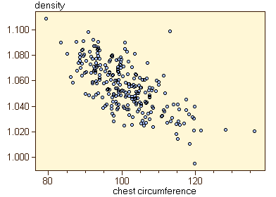
Scatter PlotA scatter plot shows the scores of the objects of one variable plotted against the scores of another variable. As an example, the relationship of the chest circumference and the body density of approx. 250 men can be displayed using a scatter plot:
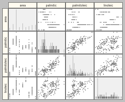
The scatter plots are arranged in a square grid; each cell of the grid contains the scatter plot of the two corresponding variables. The diagonal of the grid can be used to display additional univariate information on the corresponding variable. In most implementations the diagonal shows the point plots of the variable to get an impression of the distribution of the data. The scatter plots may also be displayed by successively stepping through all possible combinations. The following interactive example shows a data matrix with four variables; two of them being independent of each other, all other variables exhibiting some kind of relationship.
You may use DataLab to create any kind of scatter plots (use the plot option "Col/Col" and select the variables to be displayed by using the eye dropper buttons in the plot windows).
|
|
| Home General Processing Steps Visualization Scatter Plot |
|